THE BLEUE STANDARD
GREY POUPON
To distinguish Grey Poupon from a sea of yellow mustard for Millennials, we challenged ourselves to reconnect with Grey Poupon’s French roots and make Grey Poupon identifiable with the color blue. We took inspiration from French cobalt blue glassware, and the insight that the term “cordon bleu” (blue ribbon) also ties to food prepared to a very high standard by exceptional cooks.
PROBLEM
For years, Grey Poupon was synonymous to luxury, wit, and quality, but now its status has faded to the back of the fridge.
TEAM & ROLE
Brooke Leitner - Art Director, Copywriter, Designer, Social Media
Kiana Hong - Art Director, Copywriter, Packaging Design, Animation
Christany Sendar - Art Director, Copywriter, Posters, Book
CASE STUDY VIDEO

Press play to view The Bleue Standard case study video.
RE-BRAND EXTENSIONS

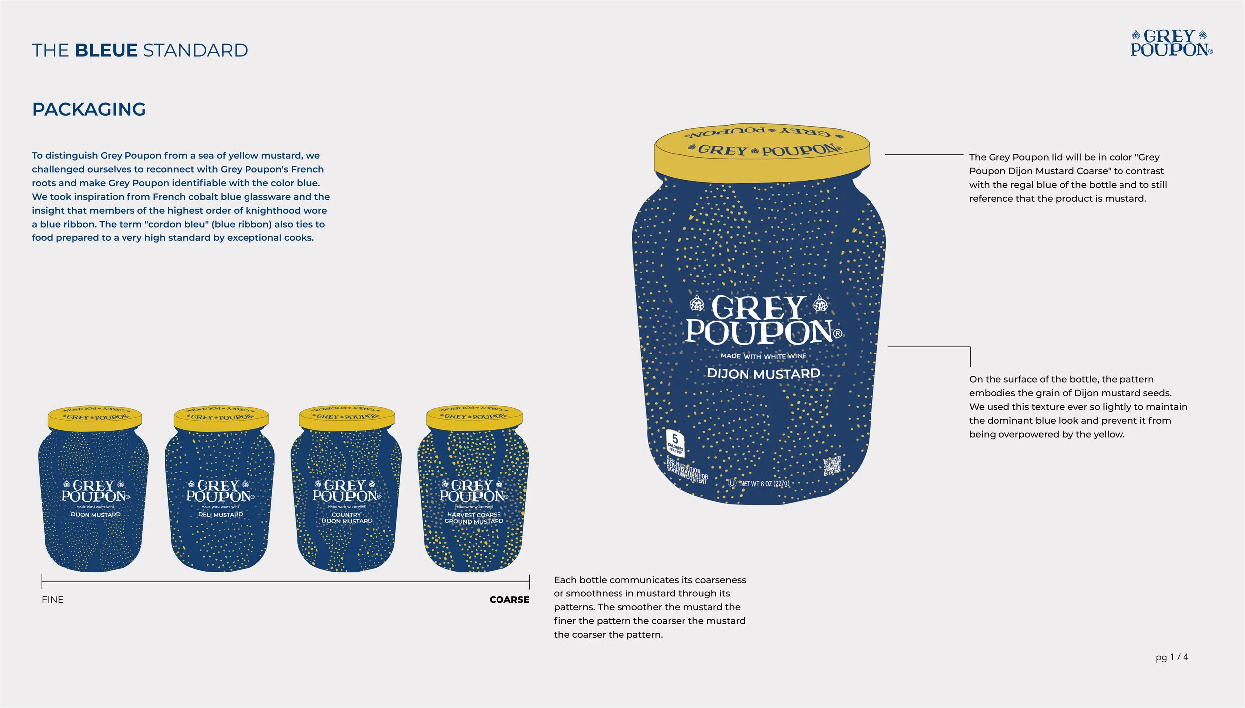
PACKAGING
Each bottle communicates the specific coarseness or smoothness of the different mustards through the mustard seed inspired pattern. The smoother the mustard, the finer the pattern. The coarser the mustard, the larger the pattern.

POSTERS
We modernized the typography and visuals of vintage French posters to appeal to affluent Millennials.

SOCIAL MEDIA
Each Instagram post touches on important insights that make Grey Poupon unique, from being “the blue mustard”, to having 4 different textured mustards, to its simple 3 ingredient recipe. These posts offer the viewer a fully branded, educational visual that ties the in-store experience to the digital experience seamlessly.

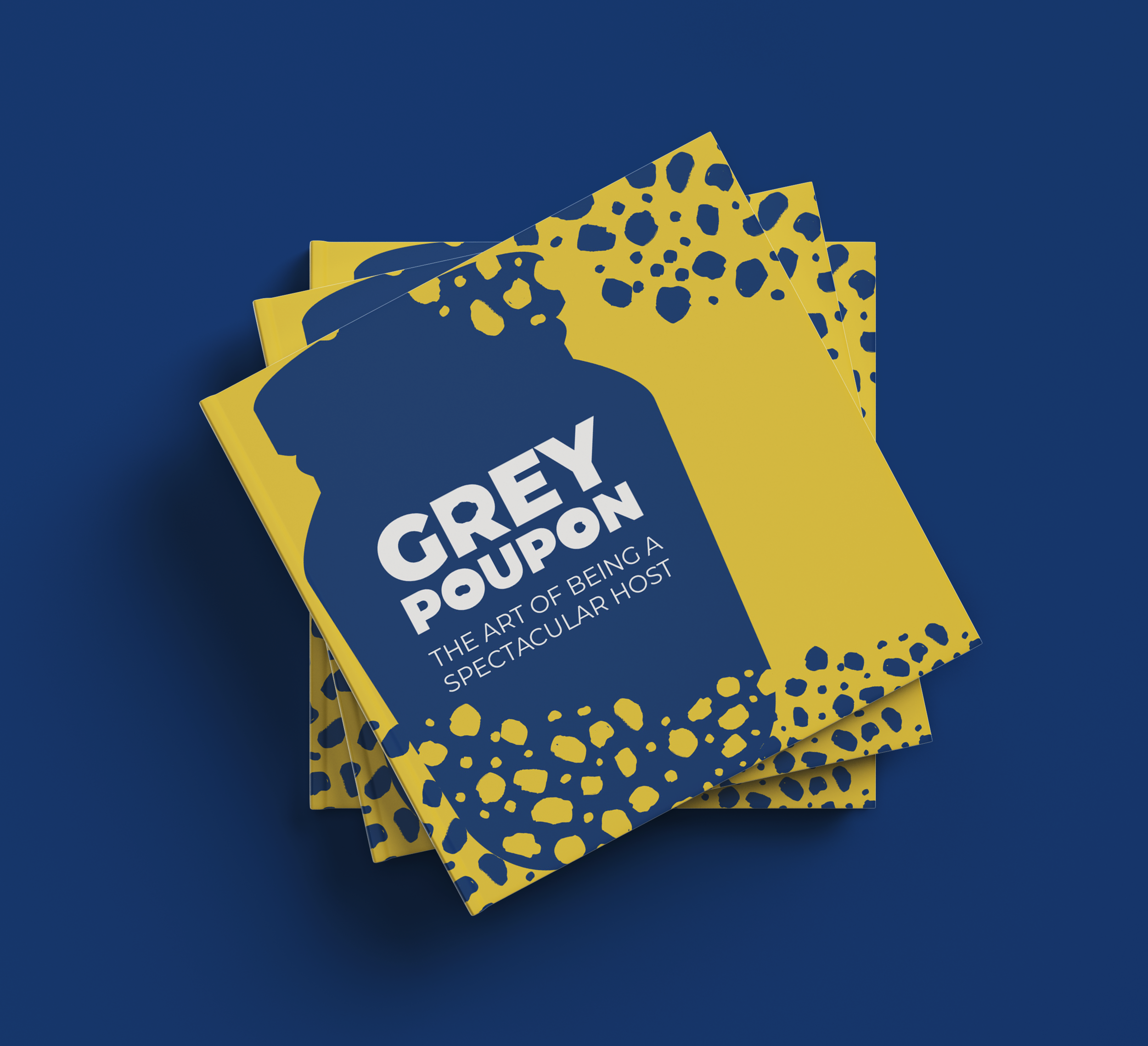
BOOK
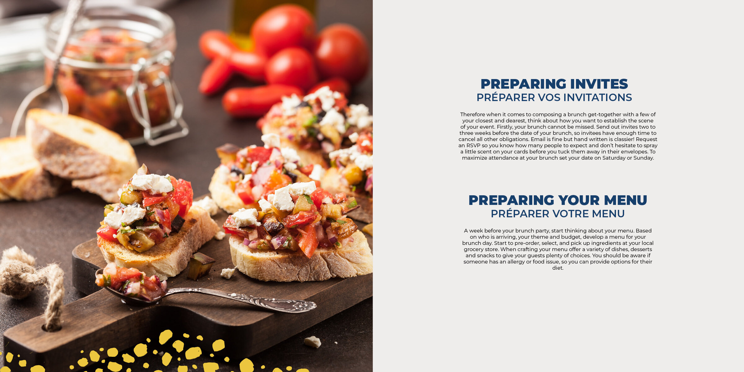
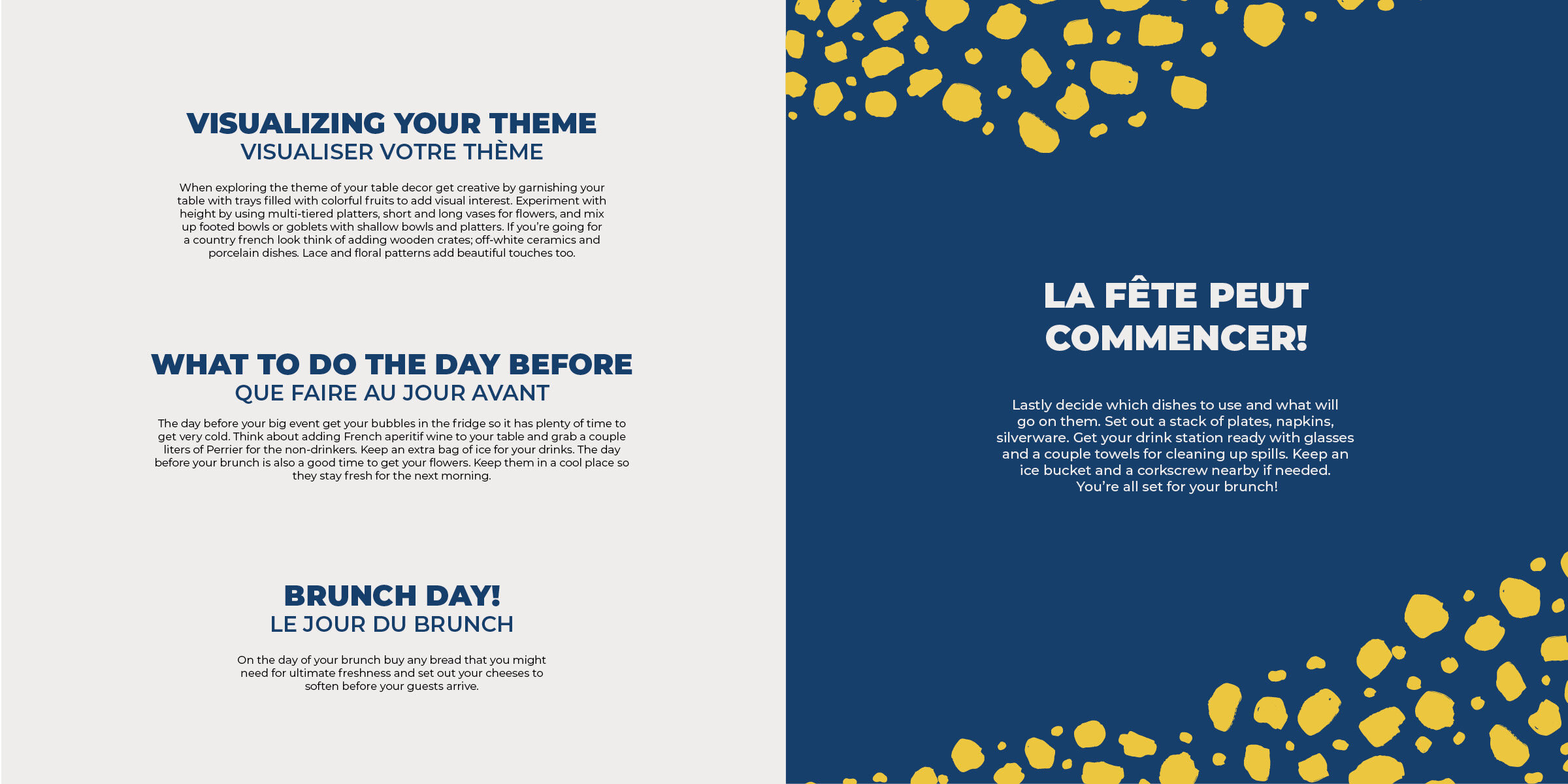
This book is an extra extension of Grey Poupon, delving into Millennial hosting culture to help curate the perfect brunch or charcuterie board.


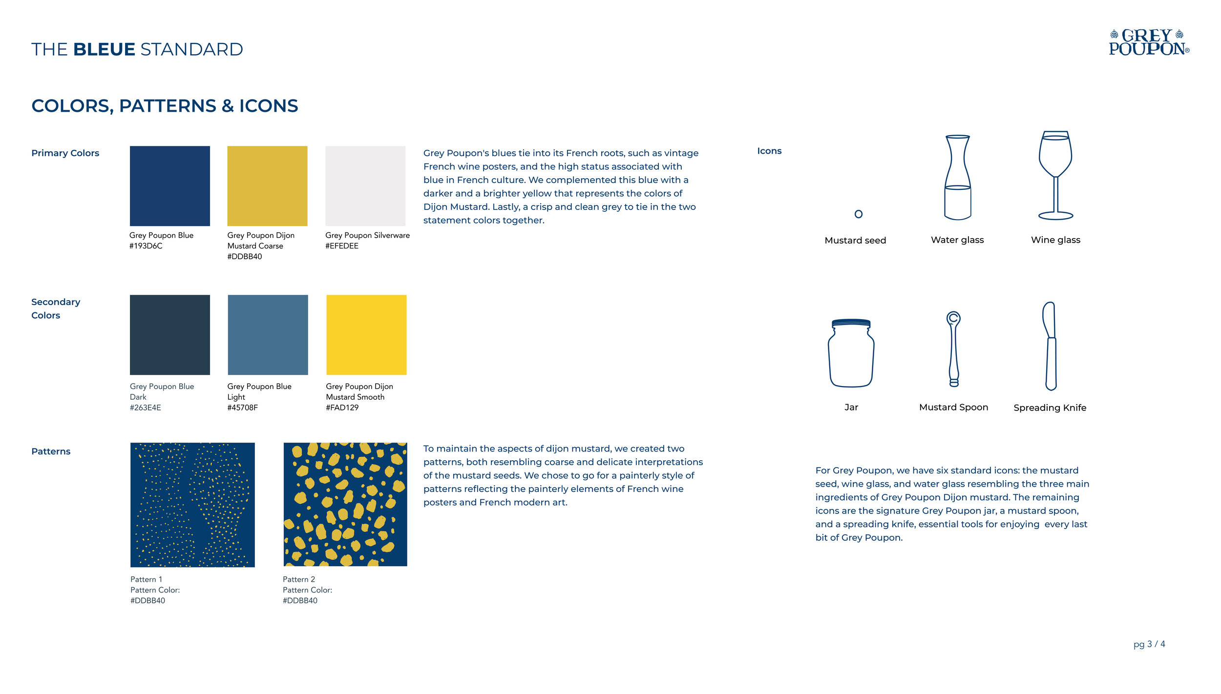
BRAND GUIDELINES