


MYmta
Metropolitan Transit Association
The MTA has over 6 different apps, which decreases functionality, accessibility, and usability for consumers. The MYmta app re-design makes for a positive consumer experience navigating MTA transportation, by combining all apps into one, simplifying travel and decreasing confusion with color coordination, and using the MTA’s established color system to create cohesive branding.
PROBLEM
The MTA has 6+ different apps and ways to access the same information, making for a horrible consumer experience when trying to navigate an already complicated transportation system.
TEAM & ROLE
Brooke Leitner - Art Director, UX/UI Designer

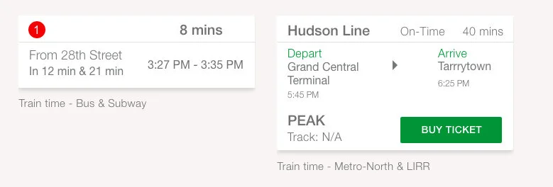
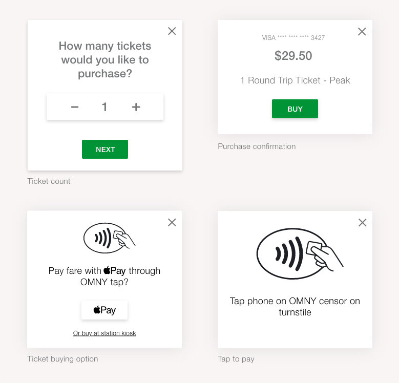
TASK 1: FIND YOUR DESTINATION
This task focuses on choosing a transportation method, a destination, viewing train times, buying a ticket, and then seeing it in “Your Tickets”.

Press play to watch Task 1: Find your destination.

TASK 2: FIND YOUR RIDE
This task focuses on the MTA’s Subway and Bus systems, by focusing on choosing a destination, choosing a transportation method and route, direction following, trains time, and buying a ticket.

Press play to watch Task 2: Find your ride.
PROCESS
TASK FLOWS & WIREFRAMES

Task Flow; Task 1: Find your destination

Wireframes; Task 1: Find your destination

Wireframes; Task 1: Find your destination
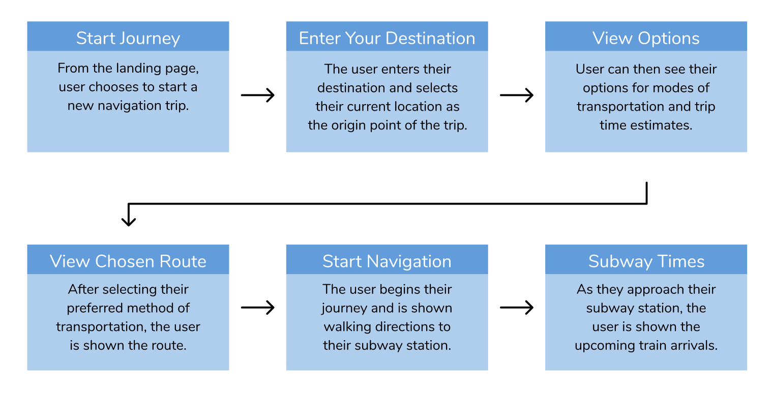
Task Flow; Task 2: Find your ride
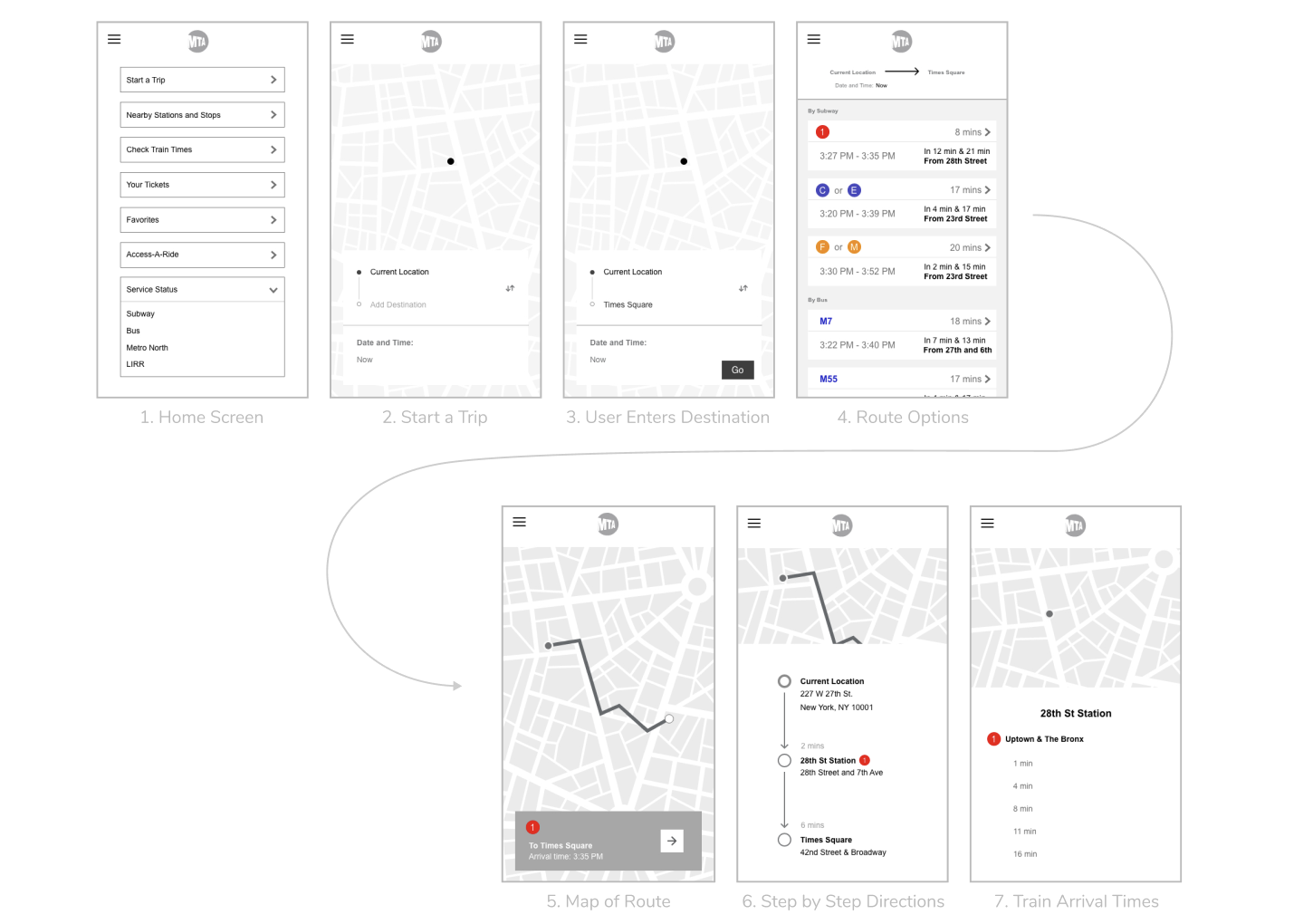
Wireframes; Task 2: Find your ride
MOODBOARD & DESIGN SYSTEM

Moodboard
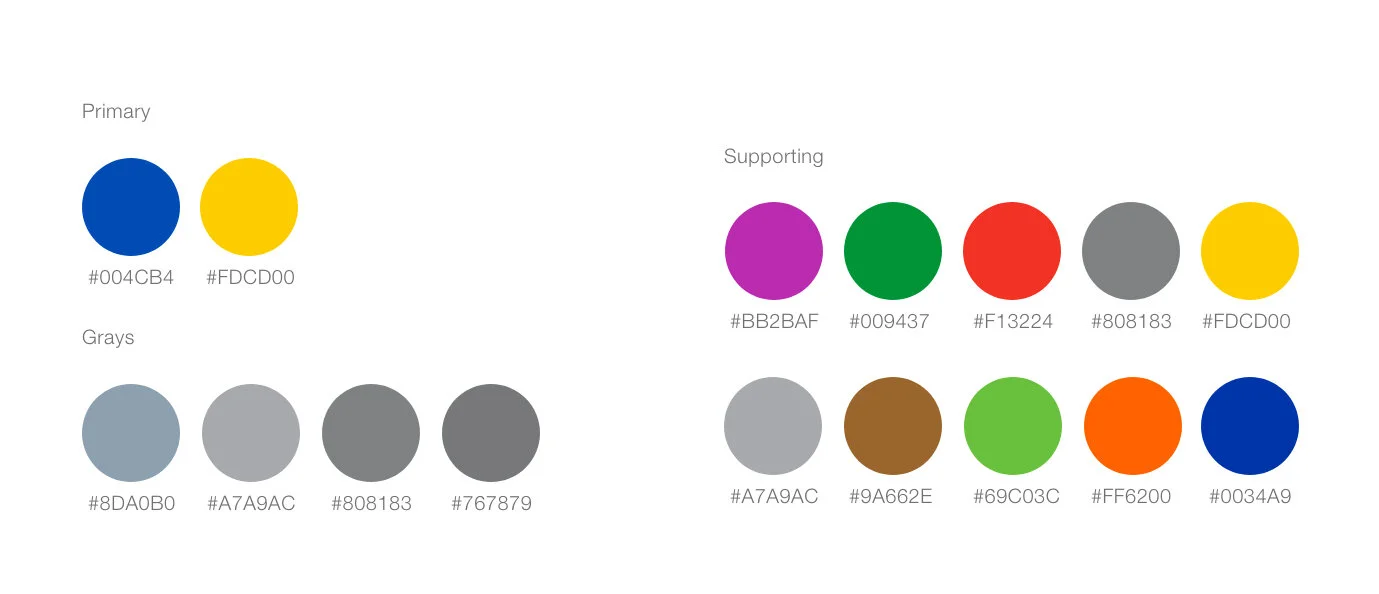
Color Palette
Icons
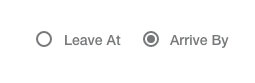
Radio

Typography
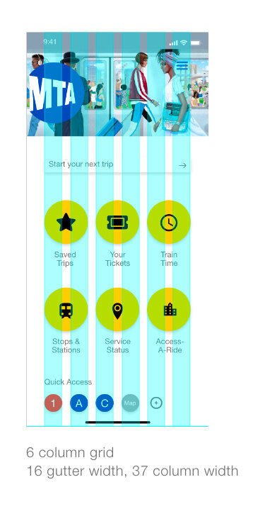
Grid
Cards

Labeled Input

List Item
Modals

Shadows
Border Radius
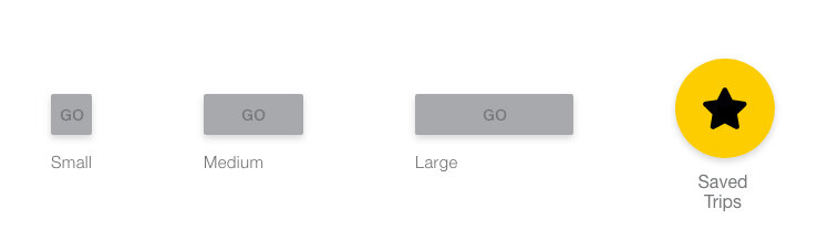
Buttons